The Donald P. and Katherine B. Loker University Student Union, or (LSU) for short, needs to present a consistent identity to ensure instant recognition of our brand among a wide variety of audiences around the world.
Our identity is important. It affects how people think and feel about the LSU. Our identity is largely shaped by what we do - our activities, our services, and our representation. Our communications play an important role in defining who we are.
Our communications are essential in helping the campus community understand what we offer and how we can support students in making the most of their LSU experience. All LSU employees and volunteers who undertake communication and promotional activity for LSU are responsible for the way in which our brand is implemented.
By applying these Loker Student Union brand guidelines, we can all make our communications clear, consistent and professional. We will be able to convey and promote the academic excellence and cultural significance of the Loker Student Union.
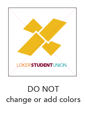
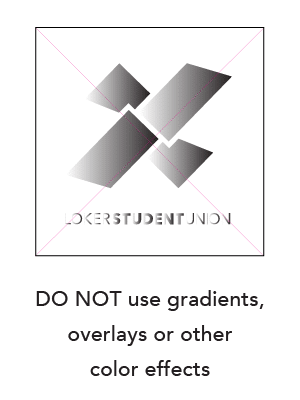
The Loker Student Union brand color palette uses the university’s recognized school colors and integrates them into the design of print and digital materials. Using the CSUDH color palettes helps to create a consistent, distinctive look and feel. The palette is also developed to complement the CSU systemwide brand program.
While there is some flexibility to mix these colors, the palette should remain light, clean and contemporary with lots of white space.
To ensure the consistency of the organization’s visual identity, Pantone Matching System (Pantone or PMS) specifications for each color are provided. Use the CMYK, RGB or HEX values equivalent to the PMS colors for four-color printing applications and digital applications.
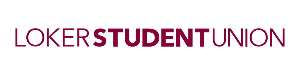
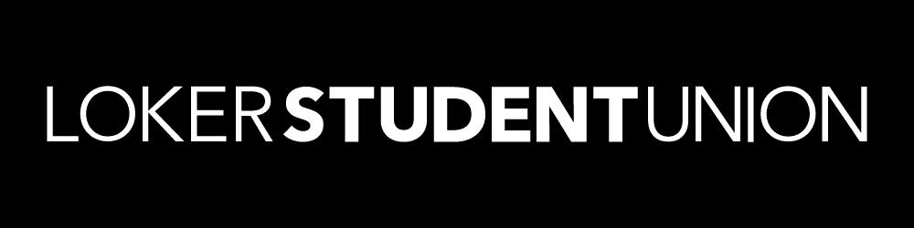
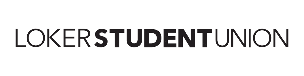
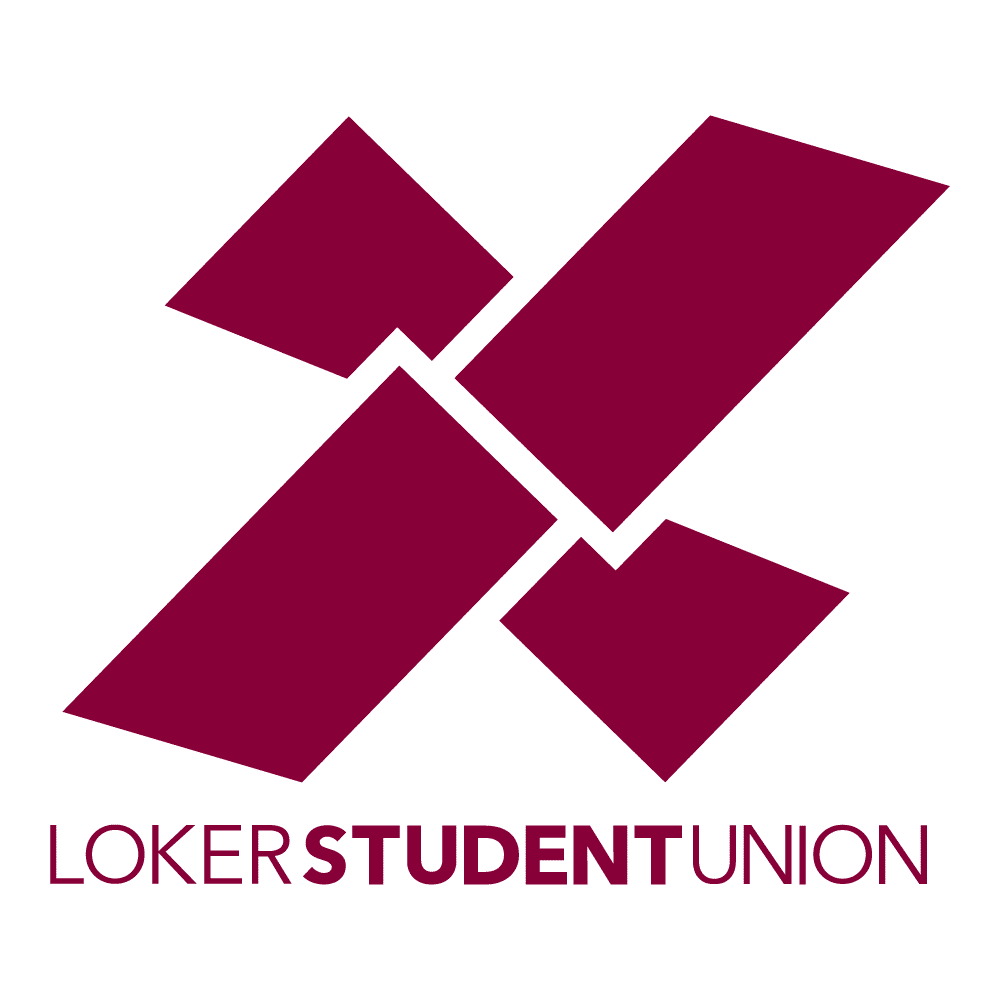
The logo and word mark are the cornerstones of all communication efforts and must be applied consistently to convey a unified identity for the organization. The LSU does not allow new or alternative logos or word marks to be used within the LSU, including logos for departments, units and programs. This is to avoid the creation of sub brands and identities competing with the LSU logo and compromising its integrity.
The LSU logo is an unregistered trademark and the LSU reserves all rights to its use. This means it can be used by any of our staff, we just ask you to use it correctly. The logo is always required on every LSU publication (prints or digital) or piece of publicity unless already provided in the footer.
We can achieve this goal through correct usage of the logo and word mark as outlined in the following pages of the brand guide. The brand guide contains guidelines for the proper use of the logo and word mark; the Manager of Marketing, Programs and Assessment must approve any exceptions.
If LSU is the primary provider of an activity or event, the logo must be in a larger size than the other parties’ logos. If the LSU is a co-sponsor or collaborator, the logo can be the same size as others’ logos.
The logo must always be reproduced from a digital master reference.
The symbolic significance of the logo and word mark must be safeguarded so that we communicate an unified identity for the organization. We can achieve this goal through correct usage of the logo and word mark as outlined in the following pages of the brand guide. The brand guide contains guidelines for the proper use of the logo and word mark; the Manager of Marketing, Programs and Assessment must approve any exceptions.
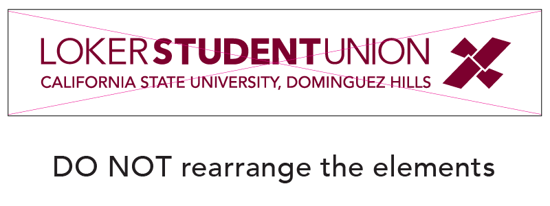
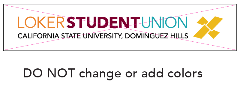
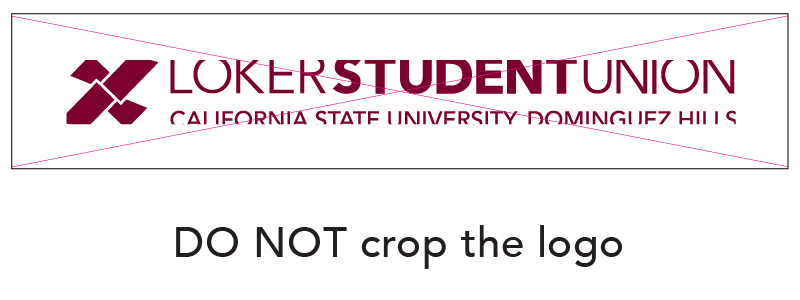
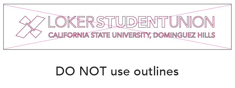
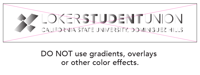
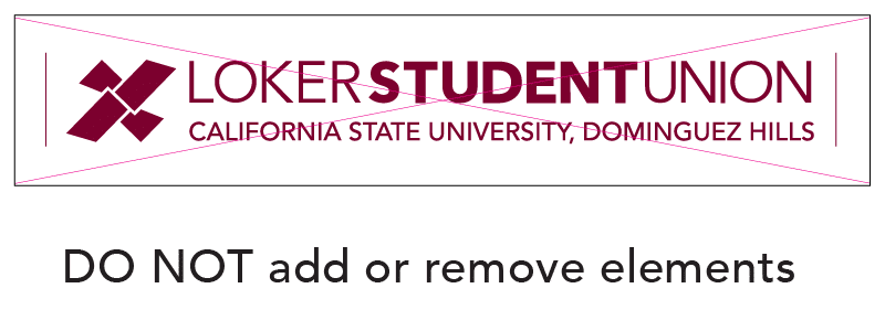
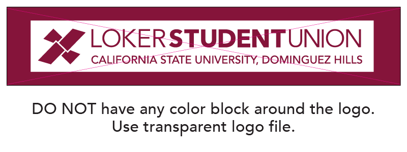
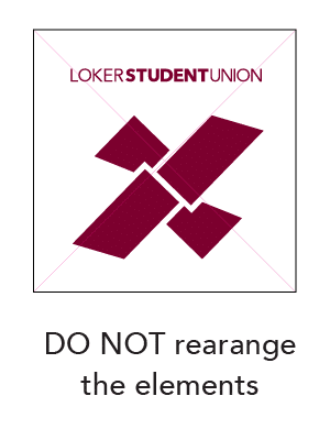
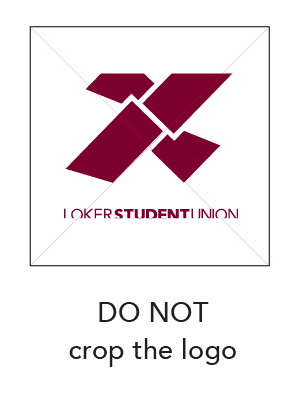
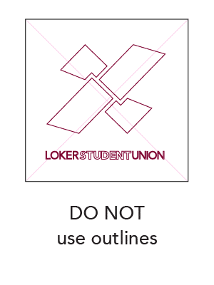
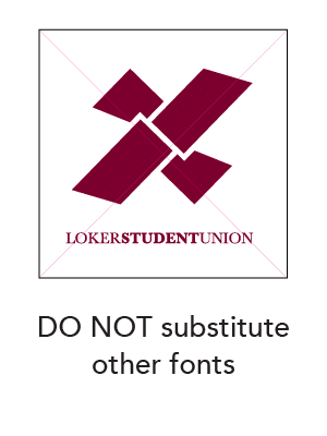
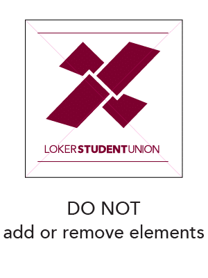
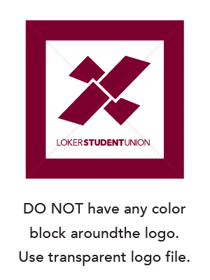
Under no circumstance can the logo be redrawn or modified. The logo must always be used with the word mark. The logo can not stand alone on selected promotional materials; however, the word mark can be used alone.
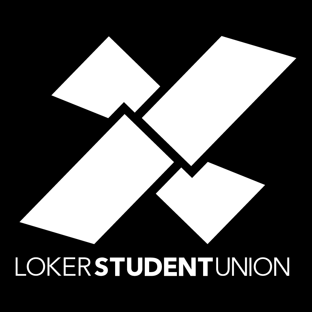
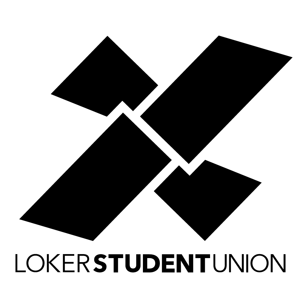
The logo will be used in the colors (depending on background color) shown below. The logo must have an appropriate quiet zone around it (half inch). This is a space in which other text or logos must not impede.
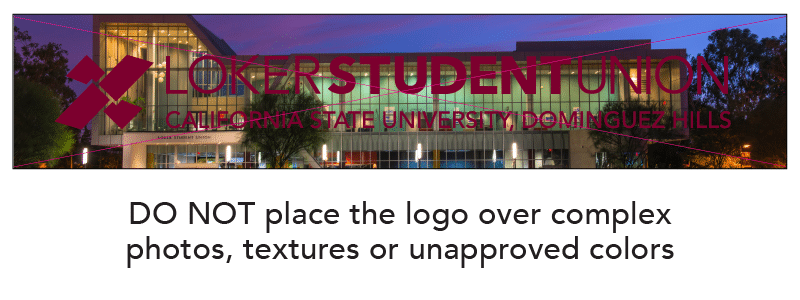
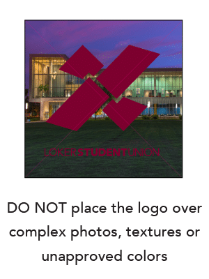
The logo must always have good contrast with the background to ensure maximum impact and accessibility.
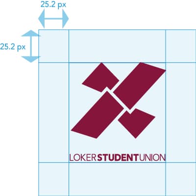
In order to maximize its visual presence the logo requires a surrounding area clear of any other graphic elements or text. Always allow at least this amount of clear space around the logo. It is important that this rule is observed and the exclusion zone is maintained at all times.
The recommended minimum clearance is to protect the logo. The logo will appear on many different applications and formats and this will help to give it clarity and presence. This is not a placement guide. It is a minimum only.
Logo size consistency is important when producing a wide range of communications.
The logo always appears in a set size and position on all our communications.
Our logo must be clearly visible and reproduced consistently. For this reason, a minimum size has been established.


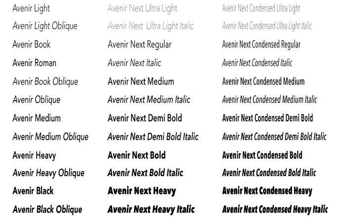
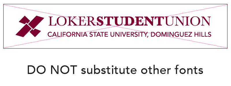
The typefaces used in the Loker Student Union communications are also brand and graphic identifiers and require the same consistency as the logos. Approved typefaces for the Loker Student Union logo and descriptors must not be altered.
The typefaces families, Avenir, Avenir Next, Avenir Next Condensed and Arial, have been selected for use on Loker Student Union print communications. The typefaces allow flexibility while maintaining a consistent visual character within the whole range of communication materials.